SMS Admin Registration
Type
Case study
Timeline
2022.3 - 2022.7
Application
Web application
Background
In North America, it's mandatory for business SMS product to meet the carrier compliance requirement. As a result, RC SMS customers are required to register for their own business based on how they want to send their text messages.
Why registration is important
As a representer for the customer company, admins are required to provide business information for their company and the detailed use case how they want to send business text messages to an organization called "The Campaign Registry" (TCR) to prevent the abuse of large numbers of messages.
Team & Process
As an end-to-end product designer, I teamed up with product owner and architect in the US to envision the workflow through a human centered design process, and partnered with local PM in Hangzhou and a feature team of 8 engineers in Xiamen to deliver the solution.

Problem
Current registration was done manually by RingCentral customers and RingCentral internal number operation team. It's time consuming and hard to maintain. At the same time, current process assumes placing existing customers under the RC-owned umbrella TCR campaigns that are created and maintained manually by RC. It's high risk - one bad player could cause blocking of the entire group(all RC customers).

Goal
The focus of this project is to design the SMS registration experience in the admin portal that would allow RingCentral customers leveraging the TCR API in order to be compliant with the requirement set by Wireless Carriers and bring most reliable messaging service for the end customers.
Challenges
How to guide admins to finish the complex registration process?
How balance the needs from admins for small business and IT admins for large enterprise?
Solution Overview
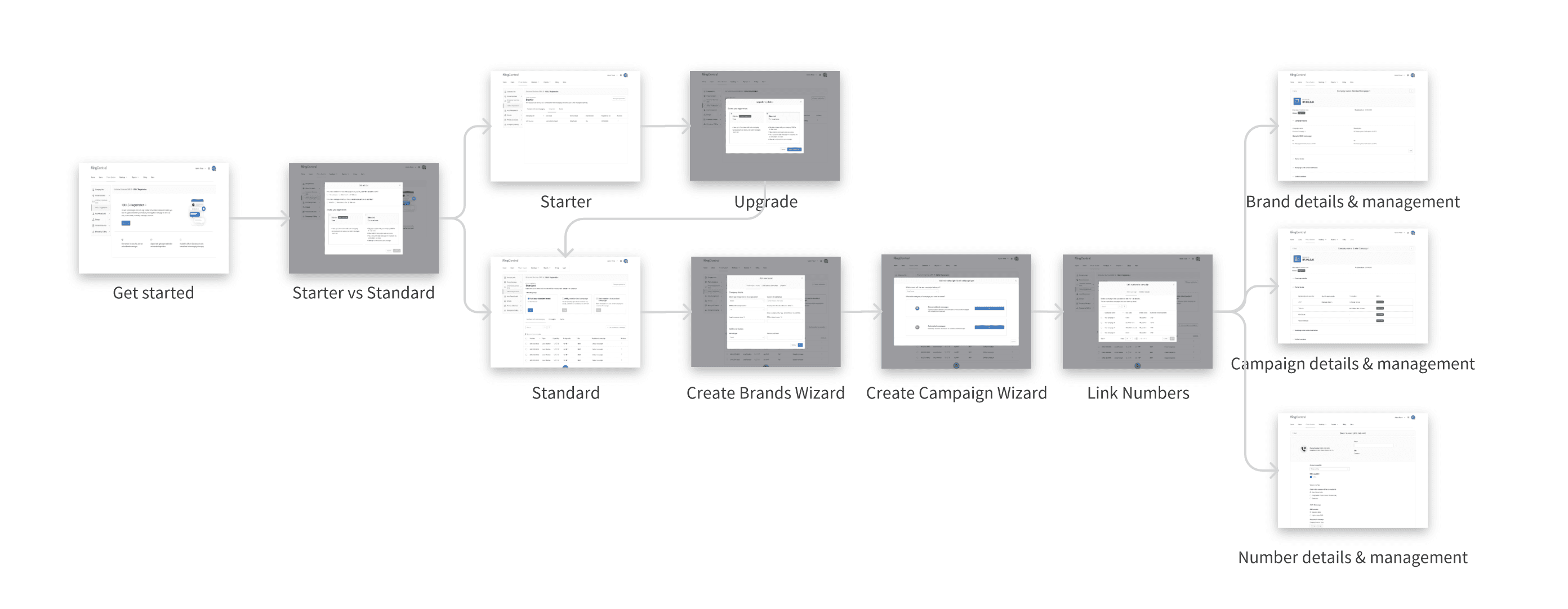
The overall flow is aiming to provide provide clear path to admins with different needs.
For admins in small business, they could complete the registration with just one click by selecting "starter" registration.
For admins in large enterprise, we will guide them step by step to finish the manual registration since more detailed information is requred.
Key Screens
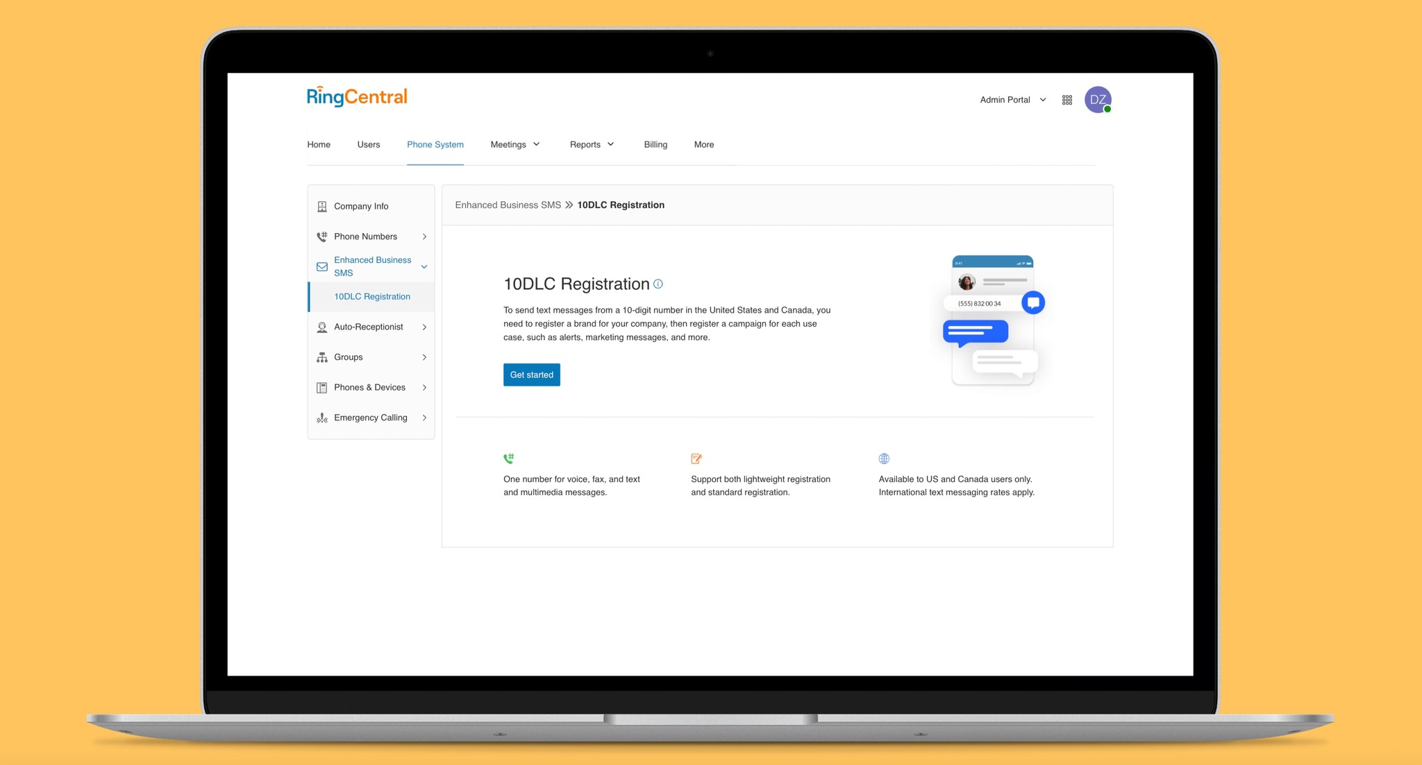
We would like to get admins started with some basic knowledge and the context about why they need registration.

Admins for small business can choose to register with one-click by picking up starter registration while IT admins for large enterprise can choose standard to register manually.

For the management view of the overall registration, we applied a "tab" layout for brand table, campaign table and the numbers table for both starter registration and standard registration. For starter registration, the layout is simpler. We also provide an option to upgrade to standard registration if needed.

For standard registration, the instruction card will be provided to guide the setup process for the first-time users above the tab layout.

For the management view of the overall registration, we applied a "tab" layout for brand table, campaign table and the numbers table for both starter registration and standard registration. For standard registration, the instruction card will be provided to guide the setup process for the first-time users.

We put a lot of efforts on introducing the concepts of different campaigns. After a lot of design exploration, we finalize the selection of campaign with a two-step selection process.

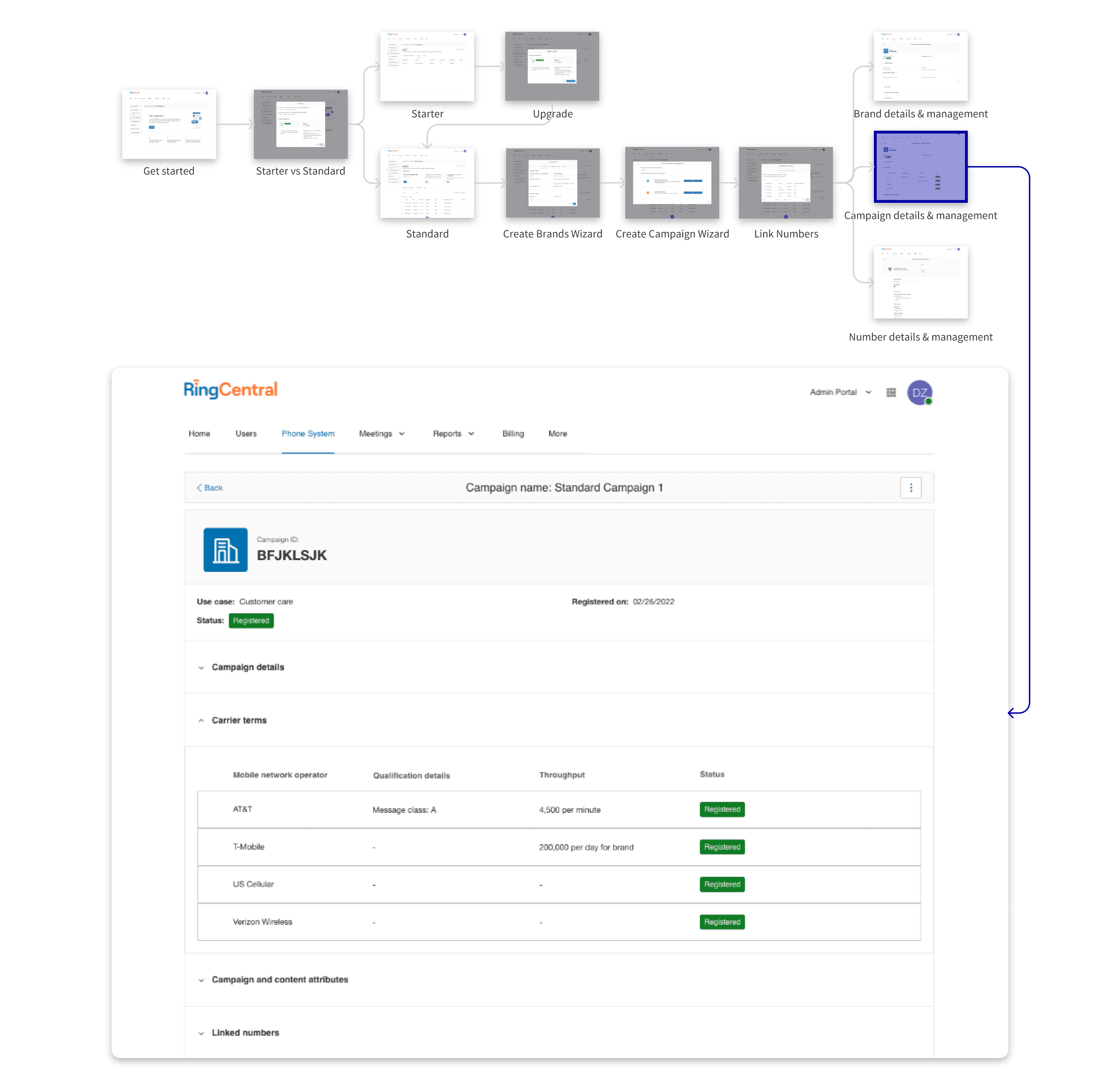
After the setup is done, details of registration can be viewed for either brands or campaigns.
Results
Saved 90% manual works for the offline registration process.
Unblocked the 5 million revenue for the business SMS product.
A blog from RingCentral about this update:

New SMS product enhancements to improve deliverability
https://www.ringcentral.com/us/en/blog/new-sms-product-enhancements-to-improve-deliverability/
How we got there?
Understand the different roles
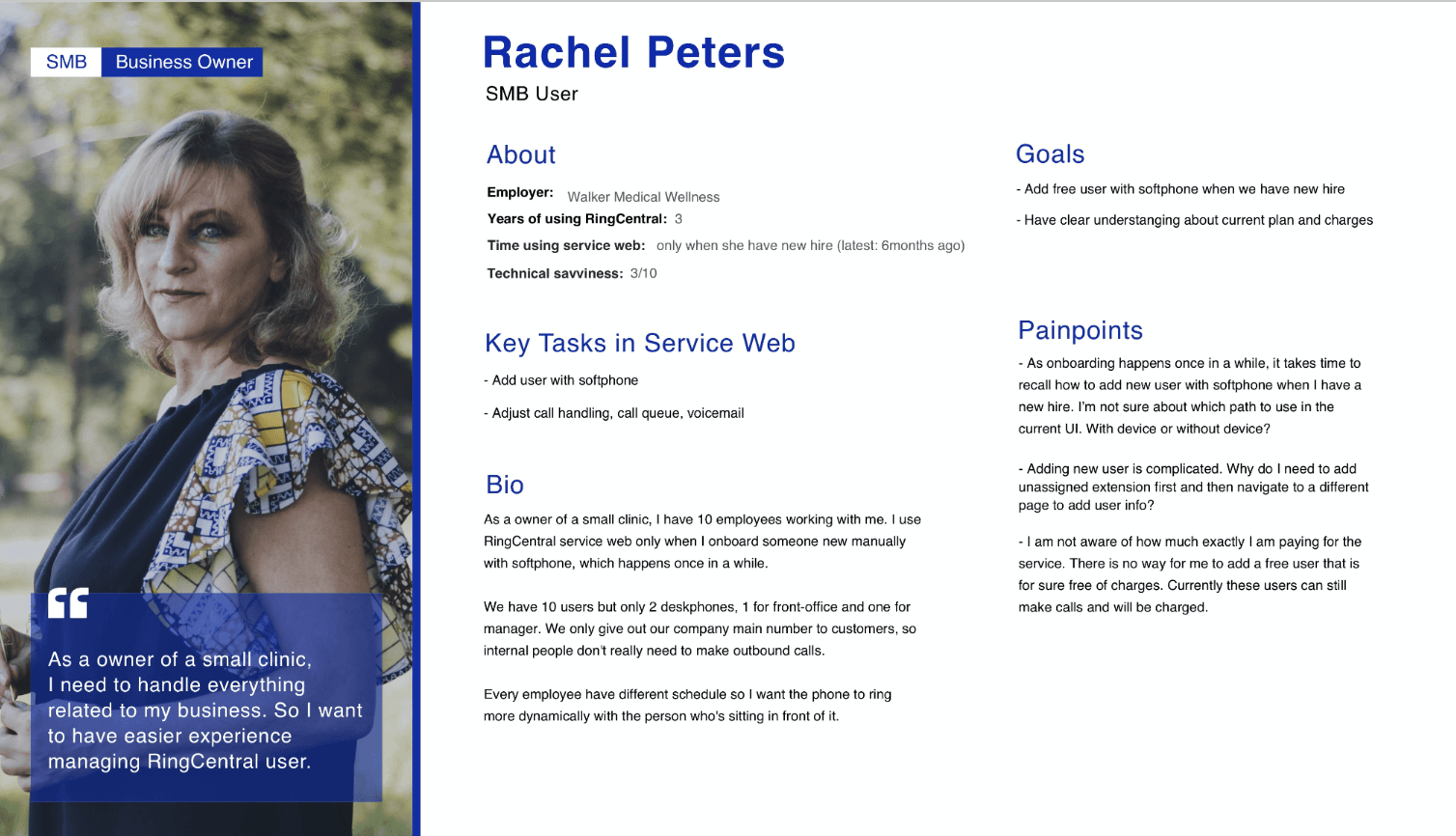
One of the key research insights lied on the various expectation from different staff roles, which we will need to balance and come up with a solution works for every role.
SMB admins need less numbers than Enterprise IT admins. At the same time, they are less tech-savvy and more sensitive about the budgets.

Dig deep into current process by interviewing
In order to collect more insights that can guide the design direction, I interviewed 1 IT admin, 2 members in number operation team, and 1 members in product marketing team to know more about the process.

Define the journey with PM
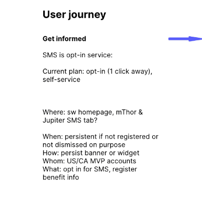
Design is a team work and good design sometimes come from developing ideas talking with each other. Based on the research, I shared my findings with the team and coordinated a brainstorming session with Product owner for SMS and PM for Admin Portal. I organized the results of discussion as a simplified user journey.


Explore the IA options
As for the initial request, we were tasked to design and build Registration Portal within the existing Admin Portal architecture. This tactic was perceived to be advantageous and the least riskiest. After some exploration, we found that the best place for the Enhanced Business SMS section was under phone system.

Knowing that early architecture decision will have huge impact for the overall experience, I spared no effort on exploring the IA options for the page layout.

Interaction design challenge
Throughout the journey, one of the biggest challenge is the selection of right use case when the admin is registering their campaign.
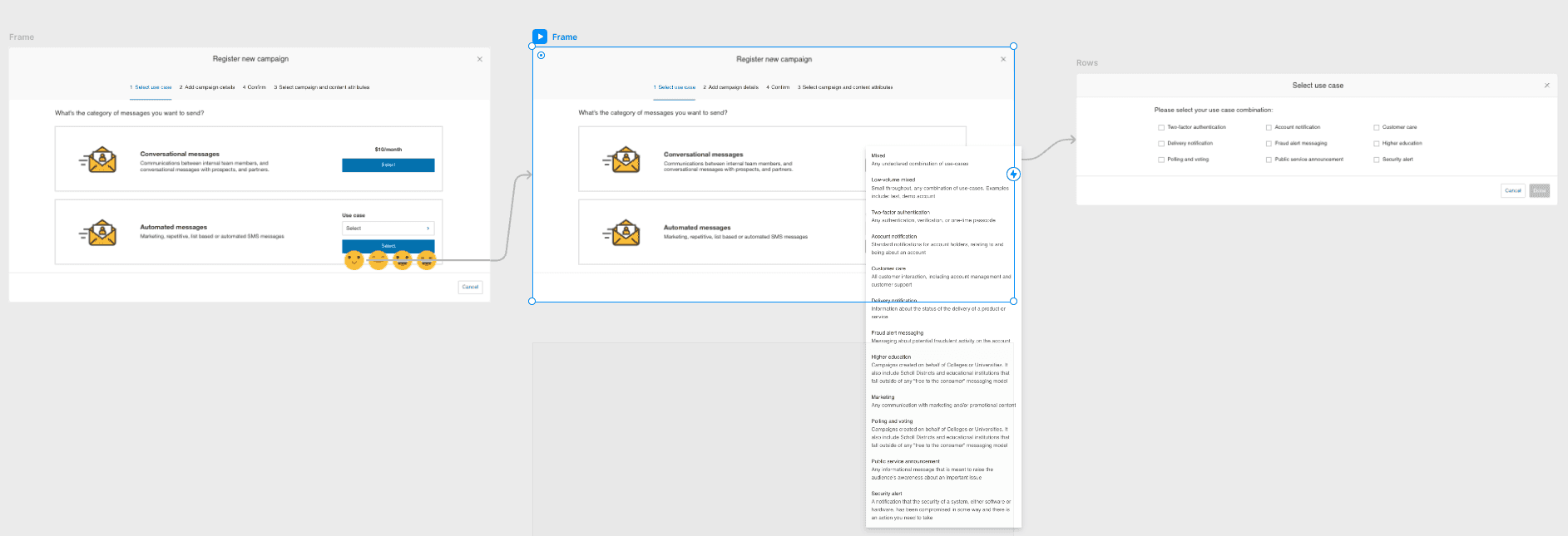
As shown in the image below, in the original TCR portal, every option of all use cases is listed directly in a two-column layout. There's no additional guidance other than customer support articles to help customers make the selection.


I believed this plain layout was not the optimized experience for the customers, based on these assumption:
I assumed that 95% customers will pick "conversational messaging" as their first and primary use case since RingCentral is the UCaaS service provider.
I assumed that it will be hard for the customers to understand whether they need to pick "mixed" use case or a specific use case.
By reading support articles from our SMS service providers and talking with number ops team who already manually handled the selection of existing customers, my assumptions got validated.
Therefore, I came up with 4 different solution for this interactions:
Option 1

Option 2

Option 3

Option 4
I prototyped these four options and got them tested by my colleagues and also got them critiqued by peer designers. Finally, I came up with a new proposal.
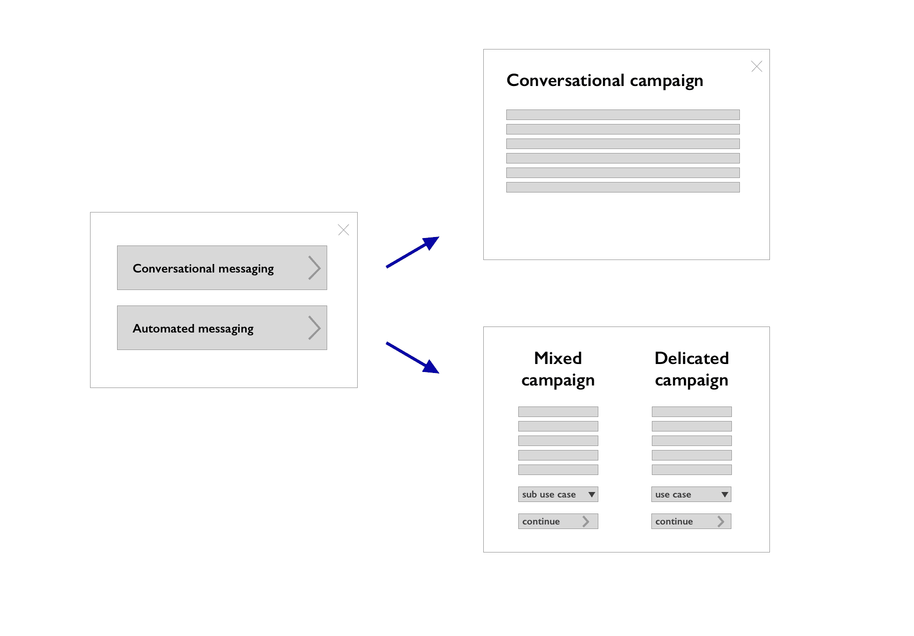

Final proposal
In this option, I not only describe and emphasize the difference between conversational campaigns and automated campaign, but also describe the difference between mixed use case and dedicated use case.
Visual design exploration
After figuring out the interaction design solution with placeholder visual assets, I started the exploration for the actual visual assets. Since the visual style of the whole platform was in the progress of transformation, I got the chance to explore different directions for visual language.


Read the next project
Jenny 2021
Xiamen, Fujian
