AppInteract
Designed a mobile application builder for small business owner
Background
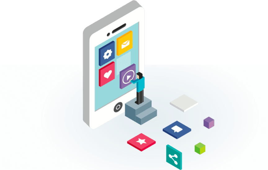
Appinteract is a new, simple, DIY mobile application generation tool for small business customers. Once users provide necessary information, they can create apps without coding, and directly publish apps in mainstream app store.
This case study summarizes my works for AI project.
Role
UX design in a team of 4 (2 researchers, 2 designers)
Theme
Small Business Owner, Mobile App Creation
Timeframe
06/2019 - 08/2019
PRODUCT VISION
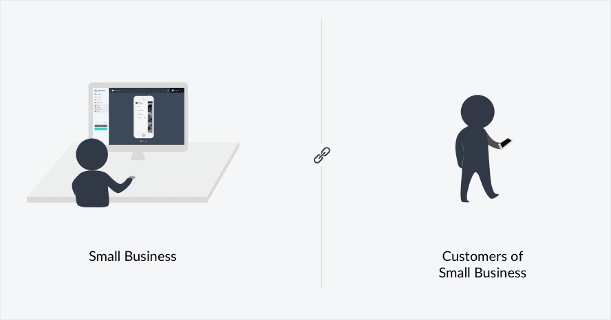
Connect with On-the-go Customers
Over years, we discovered a strong demand for small business to build the connection with the on-the-go customers. AppInteract aims to bring small business owners more connected customers, and thus more sales.
My Roles
I was part of their Experience Design and Research Team. There are one more designer and two researchers in our team. I fully participated in all stages of release cycles including meeting with stakeholders, conducting field research, ideation, user testings, iteration, as well as presenting works to gain buy-in from executives, senior stakeholders, and other teams.
The works I used here are done by myself if I don't give credits. Implementation details are subject to change since I’m not working for AppInteract anymore.
Challenges
Support Various Goals
Different business has different desired app. Therefore, the in-app features we provided should have enough diversity and flexibility to support their various business goal. What's more, the app creation flow we designed should let users find out what they can do.
Get Users Onboard
As a SaaS solution, a simple and intuitive user flow is critical for its survival. We need to minimalize the user frustration and streamline the user flow so that users are willing to sign up and make payment.
Approach
Module Architecture
The design strategy we already had in the beginning for enabling users to customize their apps is to adopt module architecture. Module architecture means that we need to build a system composed of relatively small and autonomous routines that fit together.
The assumption is simple — in order to meet the highly diverse need, the design process should be like LEGO so that users can replace or add any one component (module) without affecting the rest of the system.
This early architectural decision had a major impact on the quality of customer experience we could create since the journey of generated app might be just like browsing serveral different silos.
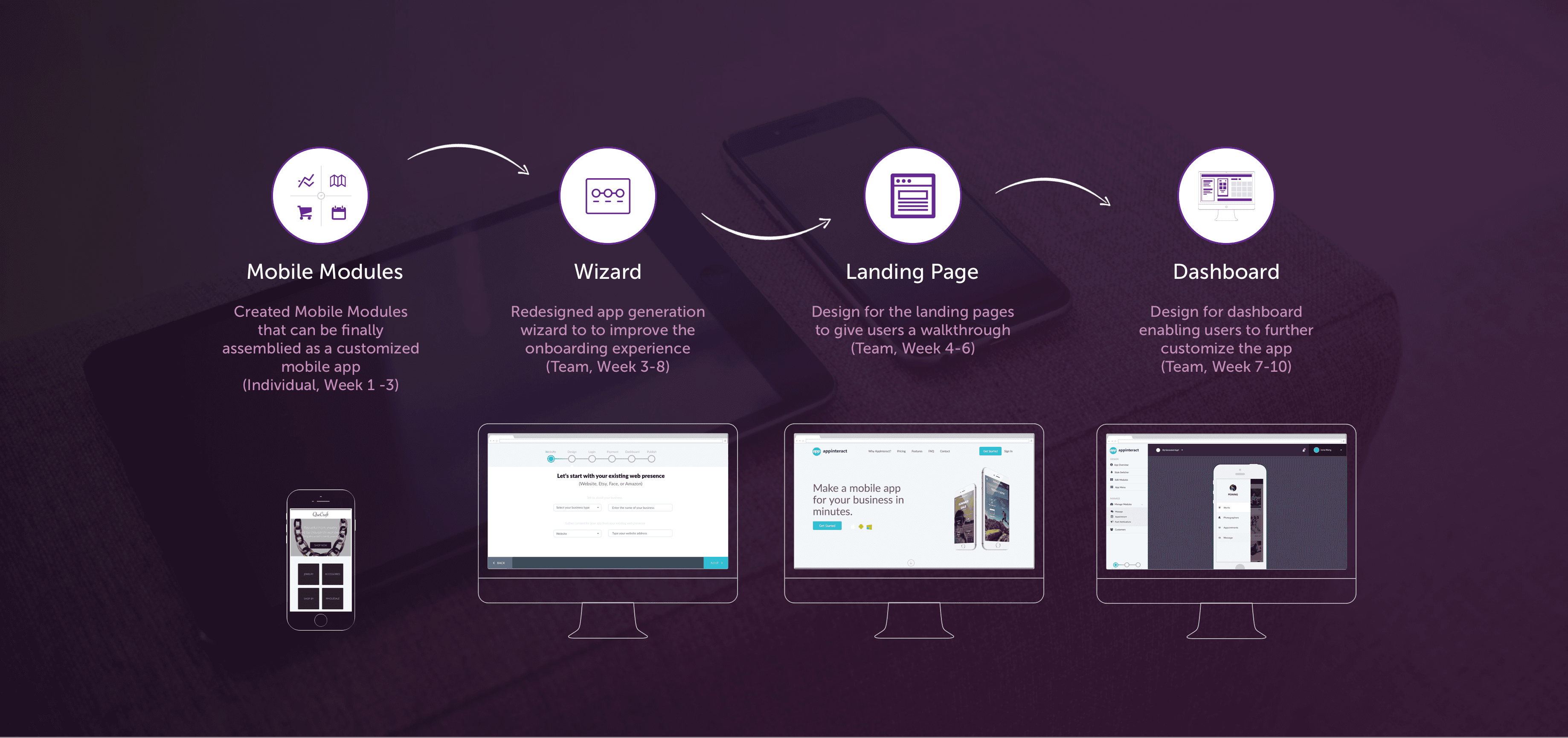
Process Overview
The process will first start by deconstructing current UX patterns on a component level called mobile modules. For the deliverables, we were tasked to construct the mobile module library. This strategy enabled our team to design modules indepently for the generated mobile app. When we test our solutions, we will test both the deconstructed interactions and the composed mobile application in order to meet the market expectation and needs for scaling. After we get more clearity about what mobile applications users will create, we start designing the creation and management flow for the web application.

How we keep our process human centered

Defining one or two user cases is greatly helpful for us to focus our design efforts. We start the projects by working closely with marketing team to wrap up existing research about the segments and interviewing small business owners about their existing digital presence. We built up two initial use stories.
We individually designed, tested, iterated different mobile modules and push the design to be relatively high fidelity. While the web application, we only create a bare-bone version that is testable. Then we started engaging customers and different stakeholders and make them part of design process.
We conducted moderated, 60 minutes long interview & testing with eight small business owners in total from different industries. We gathered and incorporated their feedback into the next stage of development, so we consistently knew we were on the right track.
We presented our findings to other teams and also got them involved in the decision-making. Some of our findings were about pricing, content strategy, technical support waw also discussed so that a company-wide alignment was created.
DISCOVERY
Key Insights
Key insights that defined the beta version of product were gathered through socializing our design as early as possible to small business and internal candidates. The research was conducted in both field and remote settings.
Features rather than modules
The in-app features should directly convey its use case rather than appear as general functional modules that could only be understandable for IT professionals.

Business Types make difference in goals
Small business from different industry has quite different understanding and expectation for the app they want to generate.
Show me what you can do
Clarity on how AppInteract would help users' business is highly expected including what their apps would be like and why it's beneficial.
Template preferred
Templates with diverse packages of functional modules and navigation styles were favored because they were thought to saved time.
The Design
Get Started Quickly
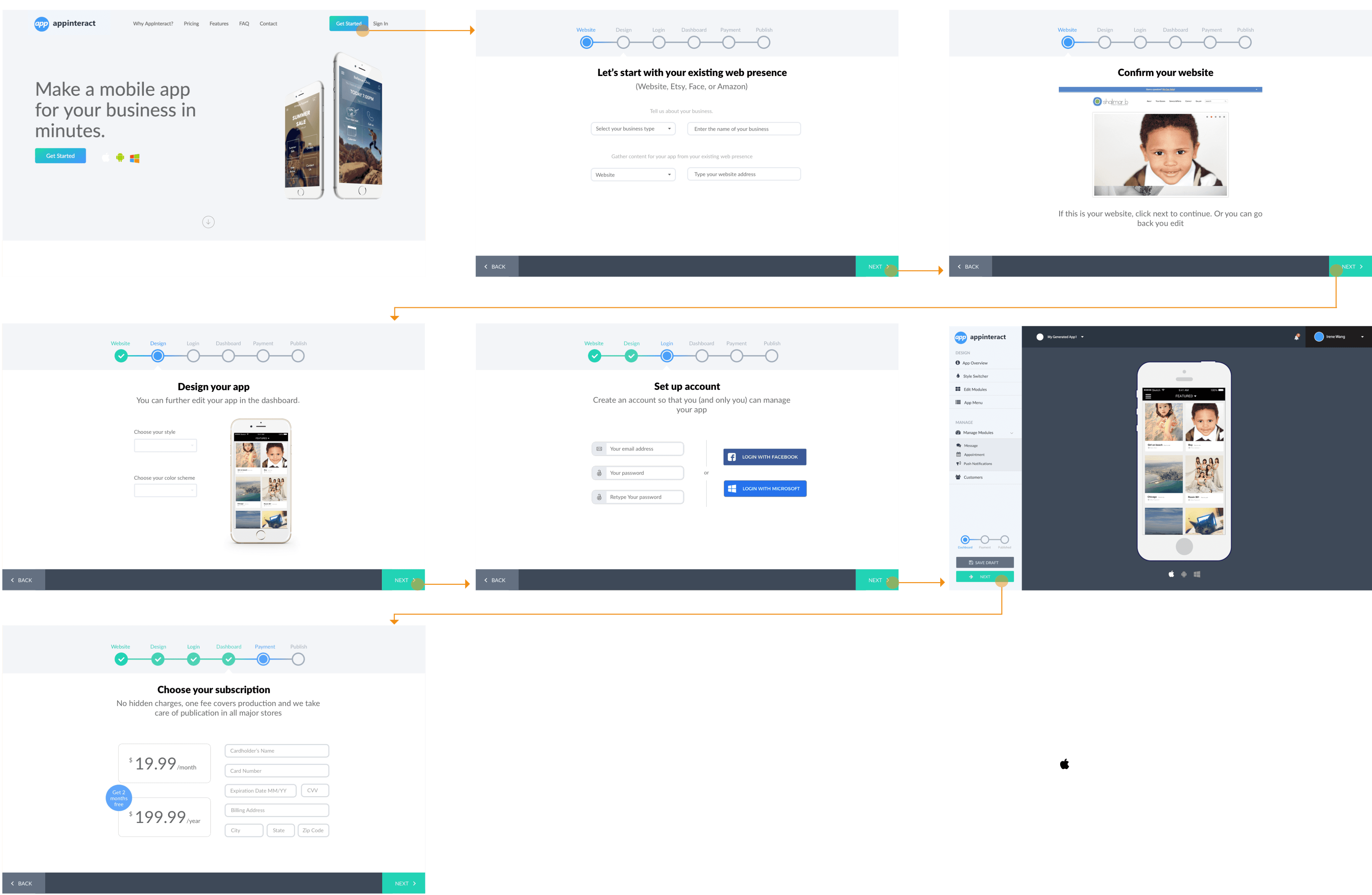
When opening Appinteract, users can quickly get started by entering the basic info of her business in existing web presence (e.g. website), and then preview the app that consists of pre-configured functions for her business.

Do some Basic tweak
By choosing among several different navigation templates and color styles, users can tweak their app before signing up.

Play the app
The app in the preview is playable. Users are able to know what the generated app can do, how it will potentially help their business, and also what need to be changed further.

Login to dashboard
After previewing, users will be invited to create account so they canenter the dashboard to edit the app further.

Edit the app functionality
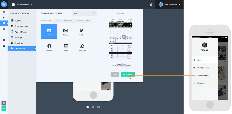
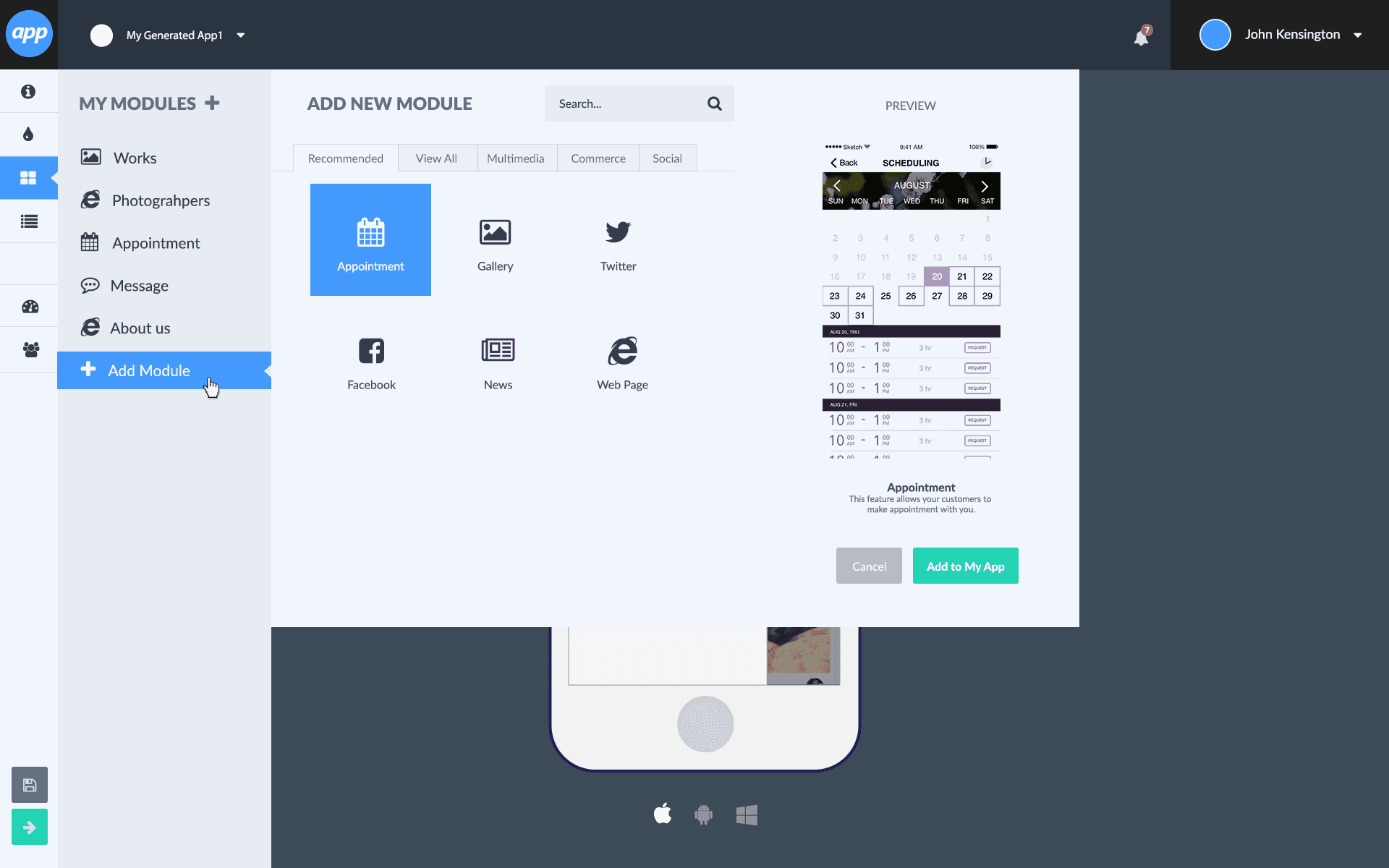
In the dashboard, users can edit the functionality of their app by adding or removing modules in the app.These modules are customized for small business.
Payment, and then publish
Before publishing, users need to subscribe a plan to continue.

Manage the app after publishing
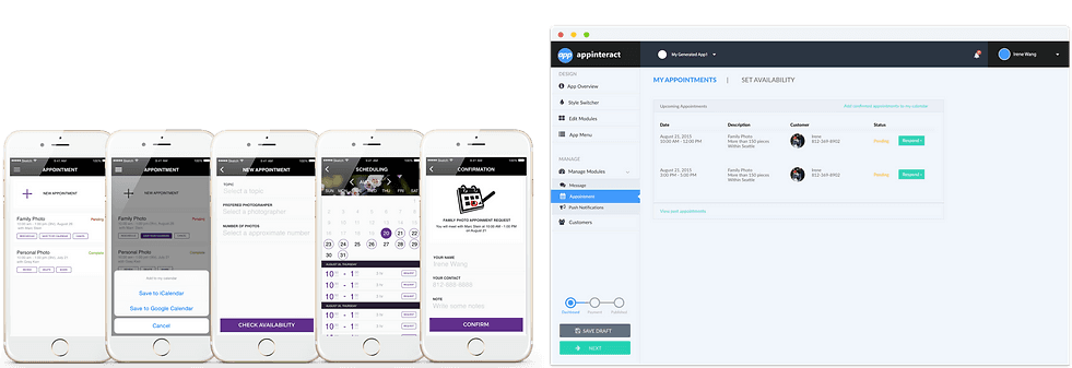
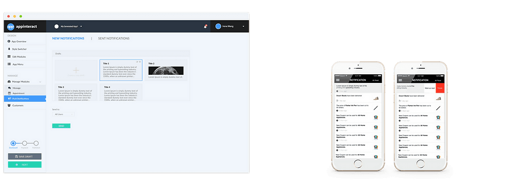
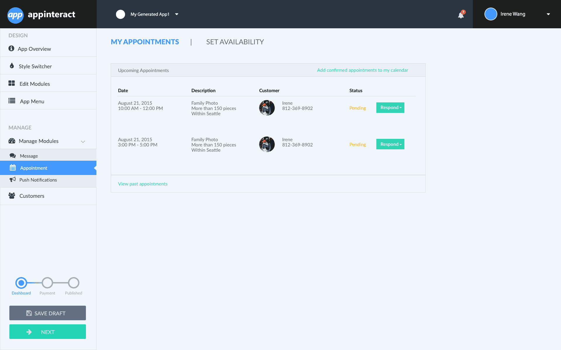
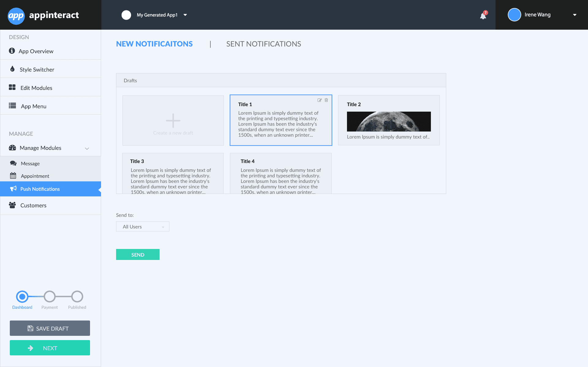
After publishing, users are able to let their customers download their app, and manage their app directly in the dashboard. For each module, there will be an admin interface in the dashboard.
How we got there?
THE START OF THE JOURNEY
Mobile Module Library
The biggest challenge I faced throught this project was moving forward my design, whilst the other parts of the project were still in the state of chaos. This challenge was especially hard when we started to construct the mobile module library. Since the in-app features are the direct benefit we could offer that can connect users' business with on-the-go customers, and keep them come back for more, these module design projects while small would make a big impact.
User Story
As for a new product, defining one or two user cases is greatly helpful for us to focus our effort. Through closely viewing websites of local business and discussion about the product positioning, we built up two initial use stories.
Later on, we iterated and expanded the user story after we had access to target users. But these initial user stories really guide design decisions, priorities, and create empathy amongst our team in the early stage.
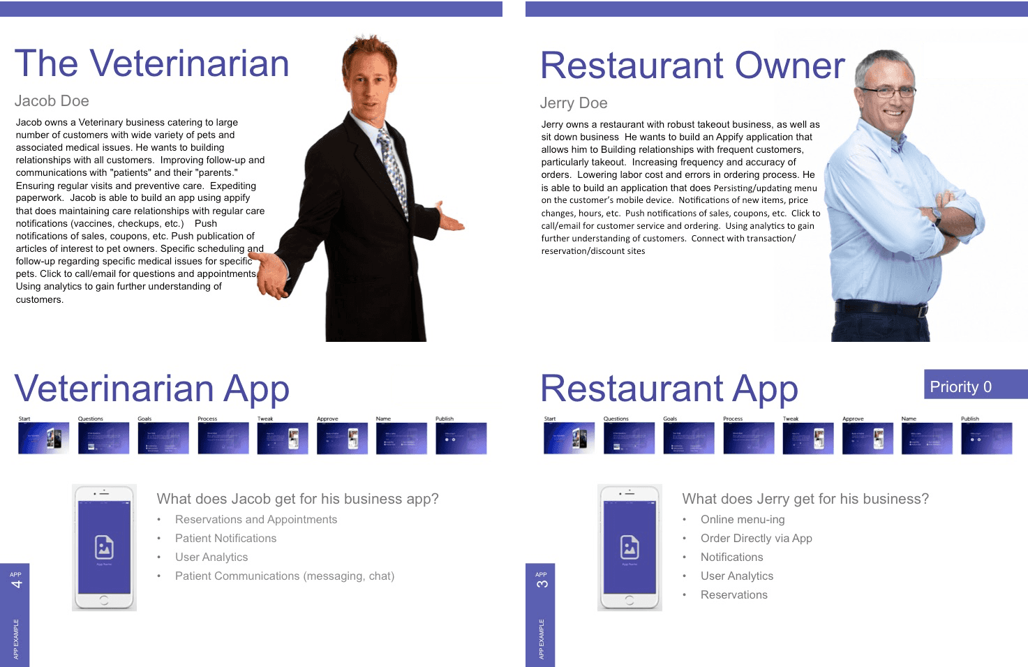
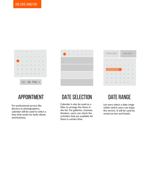
With the help of use story, I was able to identify the use case of each module, and then finished the interaction design accordingly. Here are the considerations I put for shipping the modules:
Small business (Users): how can modules support their business?
End customers (Users): how to make modules intuitive and user-friendly?
Engineer: how can the modules fit into the plan for beta version launch?
System: What's the role of the modules in the whole system?
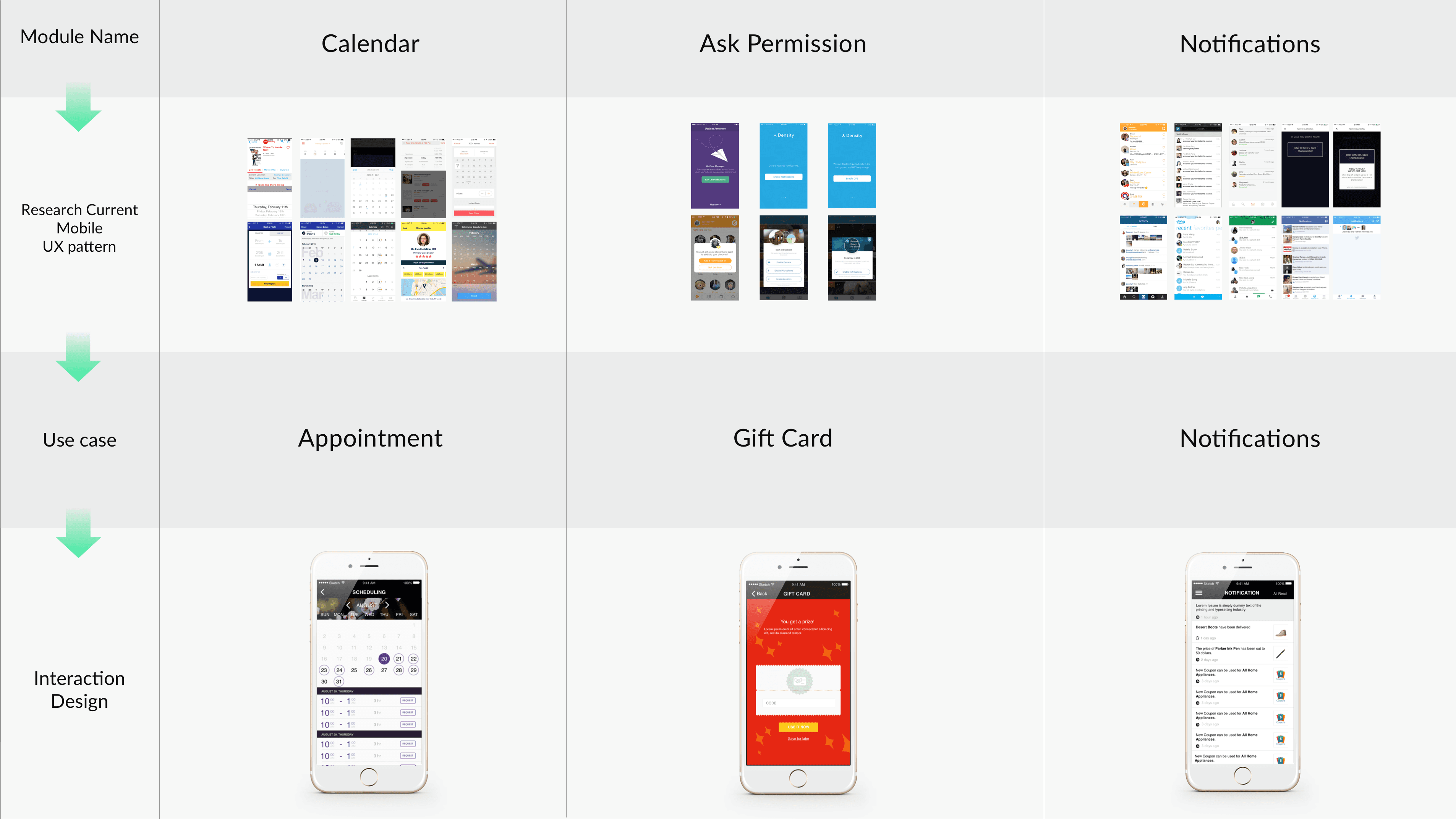
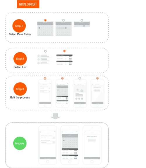
The Challenging Calendar Module
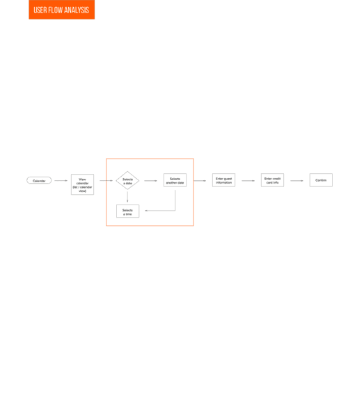
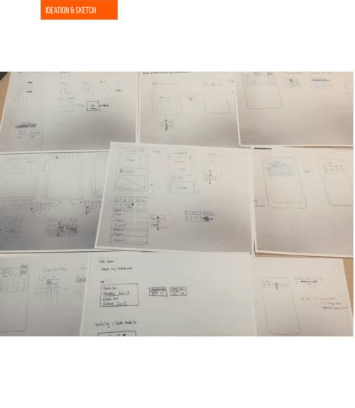
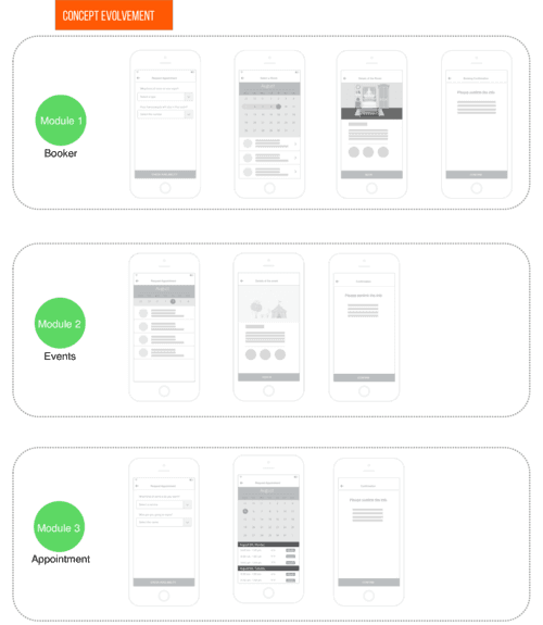
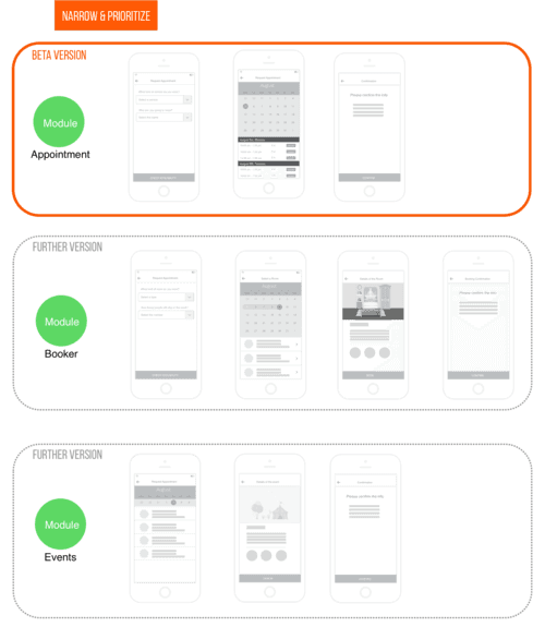
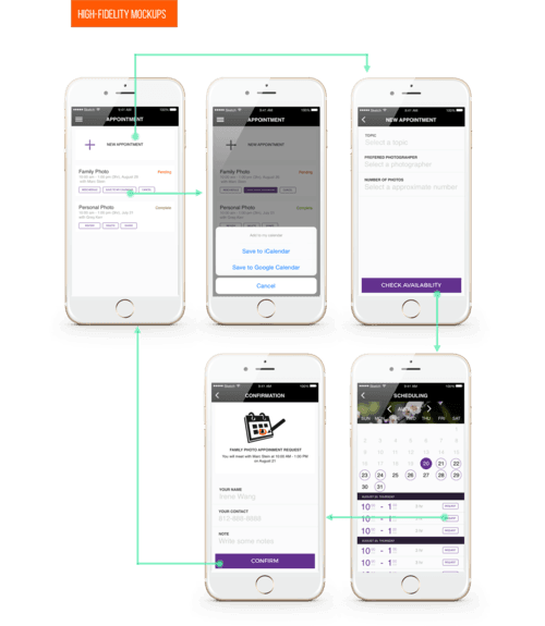
The most challenging module I worked on is the calendar module. And I would like to take calendar as an example to show the approach how I design a module.
PROCESS
Analyze use case
Analyze user flow
Ideation
Concept 1
Concept 2
Narrow down/ prioritize
Paper Prototype
Ideation
High fidelity Prototype


SECOND PART OF THE JOURNEY
Setup Wizard Redesign
An intuitive and engaging creation process would be the key to the success of our service. We started the process by planning and conducting user testings. Our primary goal is that:
Guide users to create an app that is helpful for their business goal;
Make the process engaging and minimalize user frustration.
Here were the initial screenshots
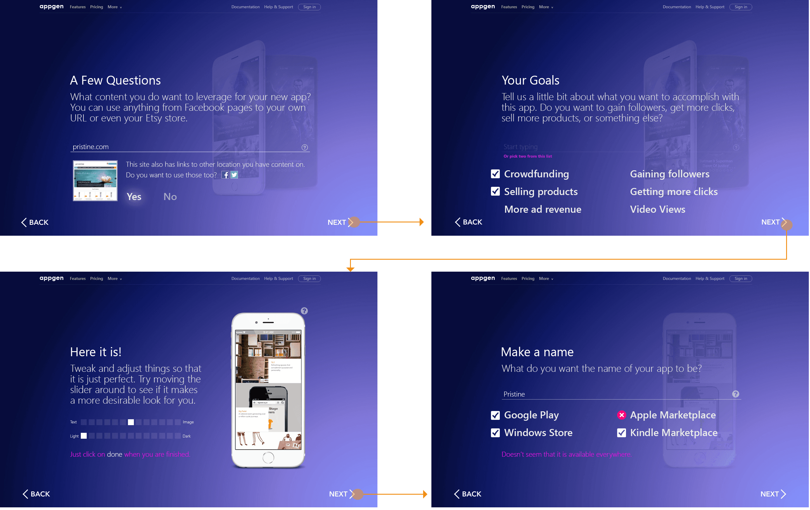
Test Process
As part of this process (and all of our projects), we had a very specific way of testing the solutions. We repeatedly test solutions as we build them, as part of our iterative, co-design process with our stakeholders. In this case, We conducted moderated, 60 minutes long usability tests with eight small business owners in total from different industries. We gathered and incorporated their feedback into the next stage of development, so we consistently knew we were on the right track.

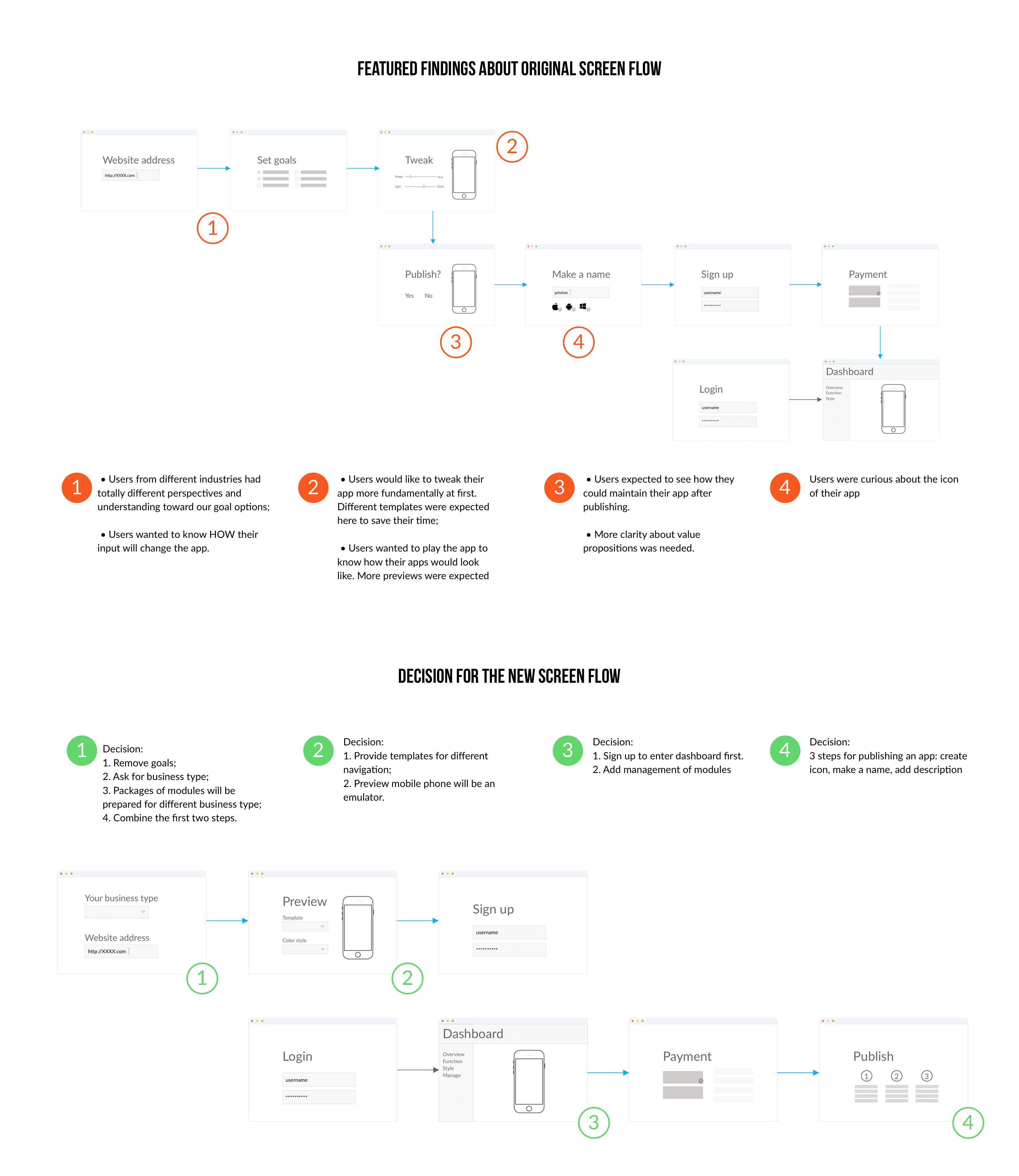
How we made the decision
It was worth a mention that the decisions in response to the findings were not merely made by design team. We presented our findings to other teams and also got them involved in the decision-making. Some of our findings were about pricing, content strategy, technical support waw also discussed so that a company-wide alignment was created.
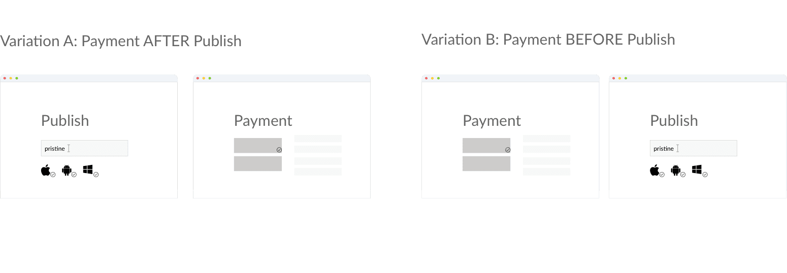
One of the most controversial decision was about whether to put payment page before publishing or after publishing. Therefore, we created 2 variations in the flow to conduct A/B test. We found that the participants were confused by seeing payment page after publishing their apps, and they complained about the flow. That's why we finally put payment page before publishing.
FINAL PART OF THE JOURNEY
Dashboard
My next individual challenge is to design the functionality part in dashboard including editing app and managing app. Concept development through testing and iteration really got me much clear about how modules would interact with users intuitively.
Cross-team Collaboration
Landing Page
In addition to app creation process and generated app, I also contributed to the design of landing pages, email templates, and other on-brand support to marketing team. This experience really enabled me to professionally deal with changing requirement and efficiently work on multiple projects at the same time.
